

CSS Grid has revolutionized how developers build complex layouts on the web. Unlike Flexbox, which is better suited for one-dimensional layouts, CSS Grid allows for two-dimensional layouts, making it easier to create intricate page designs. In this guide, we’ll explore how to use CSS Grid effectively for complex layouts, breaking down the core concepts and showcasing practical examples.
Why Choose CSS Grid for Layouts?
CSS Grid offers greater flexibility in layout design than traditional methods like floats, tables, and Flexbox. With Grid, developers can define both rows and columns, allowing for precise placement and alignment of elements across a grid. This makes it ideal for complex layouts, such as photo galleries, dashboards, or web application interfaces.
Key CSS Grid Concepts
Before diving into examples, let’s get familiar with some essential CSS Grid concepts:
- Grid Container: An element with
display: gridis a grid container. This is where the entire grid structure is defined. - Grid Items: The child elements of the grid container are the grid items. Each item can be positioned within the grid using various properties.
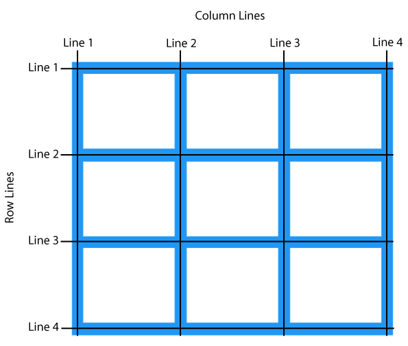
- Grid Lines: These are the dividing lines between grid cells, which you can target to define where elements begin and end.
- Grid Tracks: These are the rows and columns created within the grid.
Setting Up a Basic CSS Grid
To create a grid, start by setting a container to display: grid and defining the number of columns and rows using grid-template-columns and grid-template-rows.
Example:
<div class="grid-container">
    <div class="grid-item">1</div>
    <div class="grid-item">2</div>
    <div class="grid-item">3</div>
    <div class="grid-item">4</div>
</div>
.grid-container {
display: grid;
grid-template-columns: repeat(2, 1fr);
grid-template-rows: repeat(2, 100px);
gap: 10px;
}
.grid-item {
background-color: #8fd3f4;
padding: 20px;
text-align: center;
}This code creates a 2×2 grid, with two rows and two columns. The repeat() function simplifies the definition, and gap sets spacing between items.
Building a Complex Layout with CSS Grid
Let’s move to a more advanced example to illustrate the true power of CSS Grid.
Example: Complex Grid Layout for a Dashboard
Here’s a more complex grid layout that could be used for a dashboard.
<div class="dashboard">
    <header class="header">Header</header>
    <nav class="sidebar">Sidebar</nav>
    <main class="main-content">Main Content</main>
    <aside class="widget">Widget</aside>
    <footer class="footer">Footer</footer>
</div>
.dashboard {
display: grid;
grid-template-columns: 1fr 3fr;
grid-template-rows: 100px 1fr 200px;
grid-template-areas:
"header header"
"sidebar main-content"
"footer footer";
gap: 15px;
}
.header {
grid-area: header;
background-color: #4a90e2;
color: white;
padding: 20px;
text-align: center;
}
.sidebar {
grid-area: sidebar;
background-color: #34495e;
color: white;
padding: 20px;
}
.main-content {
grid-area: main-content;
background-color: #ecf0f1;
padding: 20px;
}
.widget {
grid-area: widget;
background-color: #e67e22;
padding: 20px;
}
.footer {
grid-area: footer;
background-color: #95a5a6;
color: white;
padding: 20px;
text-align: center;
}In this example, we define specific grid areas (grid-template-areas) for each section, making it easy to control the layout. This approach is ideal for layouts that need precise structure, such as dashboards or administrative panels.
Aligning and Justifying Items
CSS Grid provides several properties for aligning and justifying items, such as align-items, justify-items, align-content, and justify-content. These properties help you fine-tune the position of grid items and tracks within the container.
- Align Items: Controls vertical alignment of grid items within their respective grid cells.
  .grid-container {
      align-items: center; /* center, start, end, stretch */
}- Justify Items: Controls horizontal alignment of items.
  .grid-container {
      justify-items: center; /* center, start, end, stretch */
  }
Responsive Grid Layouts
One of the biggest advantages of CSS Grid is how easy it is to make layouts responsive. By using minmax() and auto-fit or auto-fill, you can create layouts that adjust based on the screen size.
Example: Responsive Grid Layout
<div class="responsive-grid">
    <div class="grid-item">1</div>
    <div class="grid-item">2</div>
    <div class="grid-item">3</div>
    <div class="grid-item">4</div>
    <div class="grid-item">5</div>
</div>
.responsive-grid {
display: grid;
grid-template-columns: repeat(auto-fit, minmax(150px, 1fr));
gap: 10px;
}
.grid-item {
background-color: #9b59b6;
padding: 20px;
text-align: center;
}In this example, auto-fit and minmax allow the grid items to fill available space and adjust based on the container’s width. The grid adapts to fit different screen sizes, making it an excellent option for responsive layouts.
Best Practices for Using CSS Grid in Complex Layouts
- Plan the Layout: Sketch your grid layout before coding to get a clear idea of how many rows and columns you’ll need.
- Use Grid Areas for Named Layouts:
grid-template-areasmake your code easier to read and maintain, especially in larger layouts. - Combine Grid and Flexbox: CSS Grid and Flexbox complement each other well. Use Grid for overall layout structure and Flexbox within individual components for finer control.
- Use Repeat and Minmax: These functions simplify code and improve responsiveness.
repeat()reduces redundancy, andminmax()makes grids more adaptable.
Conclusion
CSS Grid has opened up a new realm of possibilities for building complex layouts with ease and precision. By mastering its essential properties and understanding how to control both rows and columns, you can create layouts that are highly responsive, accessible, and maintainable. Whether designing a simple page structure or an intricate dashboard, CSS Grid is an invaluable tool for front-end developers.
Final Tips
- Practice on Real Projects: Try applying CSS Grid to real-world projects to become comfortable with its capabilities.
- Experiment with Grid Template Areas: Use named areas to make layouts easier to understand.
- Keep it Responsive: Always use properties like
minmax()andauto-fitfor adaptable, screen-size-friendly designs.
CSS Grid is a powerful way to build sophisticated, responsive web layouts. By learning and practicing these techniques, you’ll gain the skills needed to use CSS Grid for any layout you can imagine!
Leave a Reply